ABInsight | The Flight to Safety Part 2 (of 2) – Multifamily, Stability Against the Storm
The Flight to Safety Part 2 (of 2) – Multifamily, Stability Against the Storm
By: Thomas M. Brophy, Director of Research

Come gather 'round people
Wherever you roam
And admit that the waters
Around you have grown
And accept it that soon
You'll be drenched to the bone.
If your time to you
Is worth savin'
Then you better start swimmin'
Or you'll sink like a stone
For the times they are a-changin'.
-Bob Dylan, "The Times They Are A-Changin"
Times They Are A-Changin
In Part 1 I detailed the various macro-economic factors affecting the market including: Quantitative Easing (now Quantitative Tightening in the US), 50%+ of Developed Markets operating at Zero-to-Negative Interest Rates, the rise of quantum (algorithmic)/passive investing and the death of yield to name but a few. Given the market dynamics listed above investors, the world over, are increasingly on the hunt for stable yield/income producing assets. While there are many different investment and asset classes one can choose, it is my contention that the number of ‘safe harbor/steady yield/inflation hedged' assets is plummeting due, in large part, to the same Central Bank market meddling described above.
In the US, we now find ourselves at the epicenter of the Boomer retirement wave, long talked about, but now cresting. Additionally, we are fast approaching the Millennials aging boom, to last through 2023 +/-, as they reach their late 20's to 30's. Both of these demographic shifts will and are having tremendous impacts on housing and the overall investment market. As a result, multifamily, due to these same changing demographics, attractive cash flows and inherent hedge against the backdrop of longer term inflation, will be the asset du jour in the years to come.
Demographics of Stability
Rather than rehashing all that has been said about demographics, instead, I'm going highlight the main points from two separate articles on the matter with hyperlinks back to their original sources. The first excerpt comes from the Calculated Risk Blog, although from late 2014, the demographic numbers they reference continue their same trajectory. "This graph [shows the long term trend for key age groups with overlaps] is from 1990 to 2060 (all data from BLS: 1990 to 2013 is actual, 2014 to 2060 is projected). We can see the surge in the 20 to 29 age group (red). Once this group exceeded the peak in earlier periods, there was an increase in apartment construction. This age group will peak in 2018 (until the 2030s), and the 25 to 34 age group (orange, dashed) will peak in 2023."
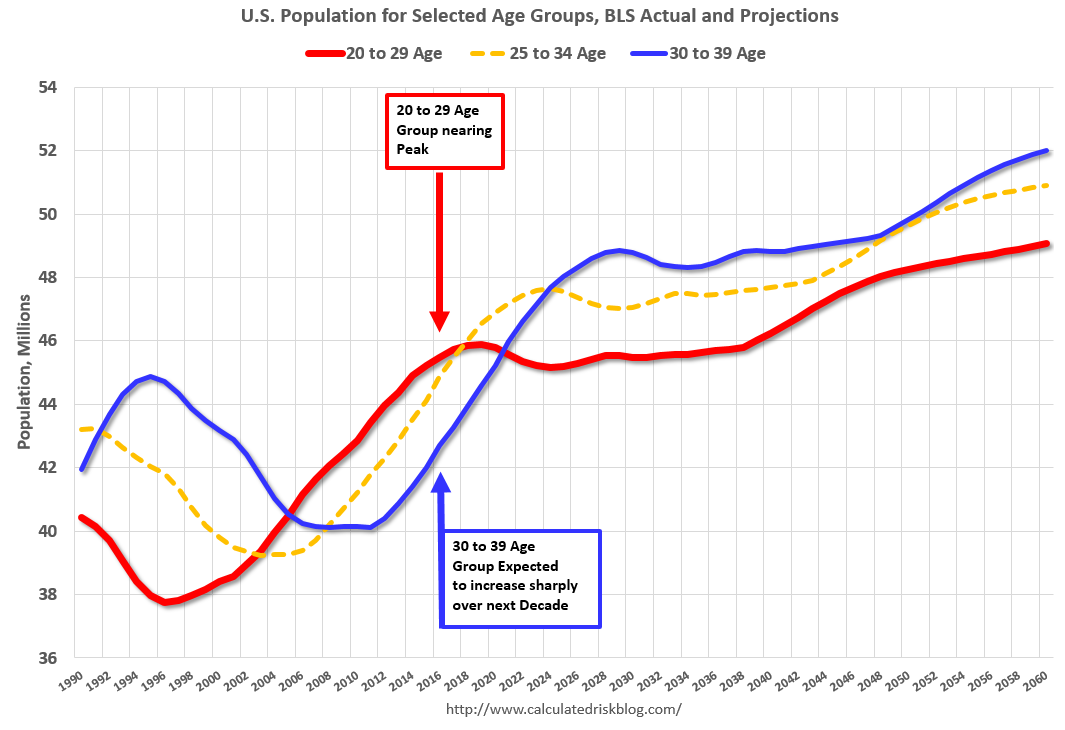
According to a Zillow's 2017 Report on Consumer Housing Trends the Median Age of today's home buyer was 40 whereas in 2010 it was 30. As such, and looking back to the graph, with the explosion in the 30 to 39 year old demographics would suggest demand for apartments will continue through 2022 +/-. If you factor in a recession occurring at some point from now to 2020, it would seem fair to assume that rentership rates should continue their increase, or potential for increase, through 2025.
Harvard's Joint Center for Housing Studies 2016 Report on demographics states:
Since 2005, the number of renter households aged 50 and over has increased dramatically, jumping from 10 to nearly 15 million, and accounting for more than half of all renter growth over the past decade….This is not just a result of the large baby boom cohort passing age 50, but is also a distinct increase in the rate at which older adults are renting. The baby boom cohort, now aged 50-69, is responsible for most of the increase in older renters. In the last decade, the boomer generation fully passed into the 50+ category, and going forward, this cohort will continue to drive up the number of renters in their 70s and beyond.
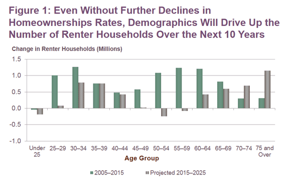
However a growing older population is only part of the story: more than half the growth in older renters stems from a decline in homeownership and subsequent increase in the share of those 50 and over who rent, a legacy of the foreclosure crisis and recession. As our 2014 report on housing for older adults noted, the homeownership rate for 50-64 year olds slipped 5 percentage points between 2005 and 2013—a larger drop than in the nation's overall homeownership rate over that period. For these owners-turned-renters, transitioning back to homeownership can be especially difficult as retirement approaches: the imperative to save for retirement may take precedence over saving for a down-payment, while weak credit may make it difficult to obtain a mortgage. Though some may make their way back to homeownership despite these challenges, it is likely that the higher rentership rates among the boomer cohort will persist as the group ages.
The demographic trends discussed above, particularly among the older renter population housing set, has broad implications in both Arizona and Southern California where many retirees are moving.
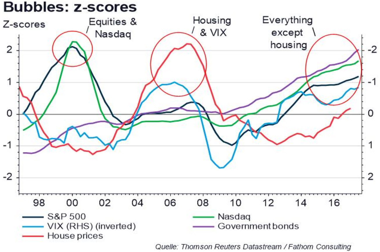
The Everything Bubble Except Housing
The chart comes from the firm Fathom Consulting and depicts where we are in the current market. While I agree with most of their assertions with regards to real estate, unlike the other assets tracked, is hyper local and must be understood, invested in that context.
As evidenced by elevated valuations, contracting CAP rates, high occupancy and sustained 7%+ rent growth, demand for multifamily housing, both from investor and renter alike, has reached a fevered pitch in the US's more coastal, gateway markets such as Los Angeles, San Francisco, Seattle and New York to name a few. These same markets have long dominated multifamily housing's recovery from the doldrums of the 2009/10 Great Recession. Beginning in 2014 through YTD, investors turned to more secondary, both interior/coastal US markets such as Phoenix, San Diego, Denver, Dallas, Atlanta etc., in which to find value and higher appreciation rates, especially as the jobs market continued its recovery albeit more muted when juxtaposed to recoveries of old.
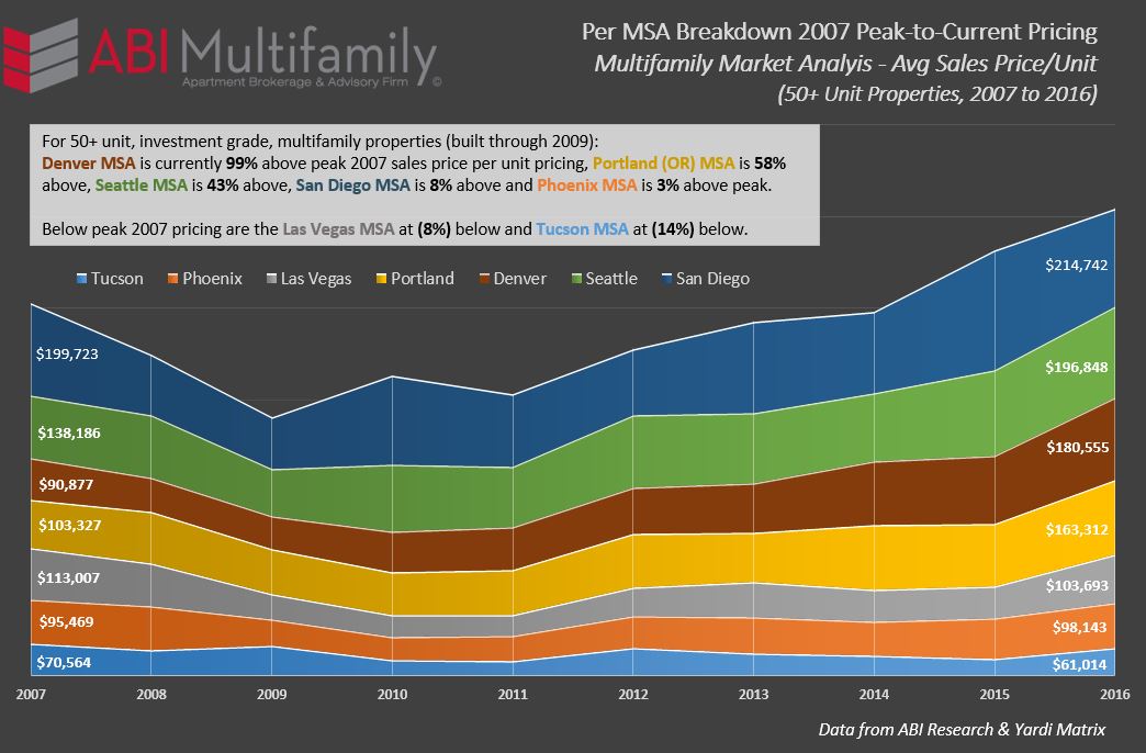
As referenced in the chart above, which is ordered by highest current price per unit amounts (on the right side of the chart), most of the Western MSA's have broken their previous 2007 peak price per unit records with the exception of the Las Vegas and Tucson MSA's. It should be noted that not all year built types are exceeding their previous peaks even in MSA's where average aggregate sales price-per-unit amounts have. For example, in Phoenix, currently 3% above its average 2007-peak, Pre-1980?s, 1990-99 and 2000-09 built product are still below their previous peak at (2%), (4%) and (6%) respectively. When taken in aggregate, sans Los Angeles and San Francisco, the West is nearly 26% above peak 2007 pricing having experienced 10%+ price-per-unit appreciation rates from its 2009/10 nadir through 2016.
Where Art Thou Investment Return?
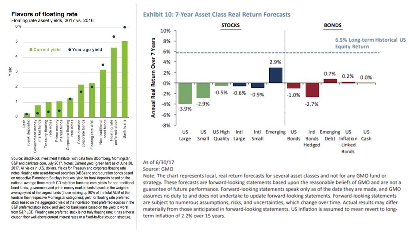
The chart, on the left side below, comes from BlackRock and depicts floating rate asset yields 2017 v 2016 and is the perfect example of the yield deterioration investors, both institutional and private, have experienced over the last 8+. The chart, on the right, shows GMO's 7-year asset class return forecast with projected rates of return, on most assets, looks decidedly more dire.
Conclusion: Multifamily to the Rescue?
When you look at multifamily returns through the lens/charts of the broader market referenced above and in Part 1; diminished CAP rates and slackening rent growth aside, 5%+ sustained returns (even in more heavily traded coastal markets) is not only doable but would be an absolute home-run. As I've previously demonstrated, specifically in the markets we cover, despite sustained increases in new construction deliveries we are still markedly under-supplied given the changing demographics referenced at the beginning of this report. (To read my write-ups on our under-supply problem click Phoenix, Tucson and San Diego).
To quote my previous article, Contact High? Western US Breaks Previous 2007 Peak-per-Unit Pricing, "I have heard it stated, on more than one occasion that at the end of 2005 is when the previous bull market really took off. Arguments can be made that it started earlier for some places but, on the whole, I'd say this hypothesis holds merit. With this in mind I asked the following question:
If 2005 was the last year of ‘sane' investment/building, what would the price per unit be now if average price-per-unit growth was a more modest 3% per annum, compounded?
The answer, to say the least, was very surprising. For Phoenix, the average price per unit sold in 2005 was $67,199. If we take 3% growth (from 2005 thru end of 2016), compounded annually, the projected price-per-unit would be $95,810. Our current price is $98,143, is only 2.5% greater. The same holds true for much of the US as a whole."
Final question, suppose real estate return rates mean revert to average historical levels of 3.8%, across the board, and average rental rates soften to 2%+, contingent upon market, where else are you going to find a better return? Investors are slowly beginning to wake up to this new market reality and, my best guess without the benefit of a future indicating magical crystal ball, is that multifamily is where they will want to be.