ABInsight | Somewhere Between Manic & Awesome
Somewhere Between Manic & Awesome
By: Thomas M. Brophy, Director of Research
Well, it's all going to pot
Whether we like it or not
The best I can tell
The world's gone to hell
And we're sure gonna miss it a lot
All the whiskey in Lynchburg, Tennessee
Just couldn't hit the spot
I gotta hundred dollar bill, friend
You can keep your pills
'Cause it's all going to pot
That cackle-bobble-head-in-a-box
Must think I'm dumb as a rock
Readin' me the news
While I'm kickin' off my shoes
And it's scarin' me outta my socks
-Willie Nelson, Merle Haggard "It's All Going to Pot"
"When you walk around all mopey, m'kay, and sayin' everything is... just shitty, well, that's called bein' a Debbie Downer, Stan. And nobody likes a Debbie Downer, m'kay. ...I mean you've gotta, you've gotta snap out of it, Debbie. Come on, Debbie, you're even bummin' me out now, m'kay? Your attitude just- just sucks."
-Mr. Mackey, South Park
"I am an old man and have known a great many troubles, but most of them never happened."
-Mark Twain
Market Reflections
As my colleagues, friends and family know, as a matter of temperament and outlook, I tend to vacillate between general cynicism and outright incredulousness. This temperament wasn't built in a vacuum, which nature abhors, rather forged from the experiences of living, and doing business, through two epicly wild market cycles – Tech (2000/01) and Housing (2007/08) bubbles. Whatever I learned from going through the first cycle was certainly lost by the time I hit the second and that's an experience I'll never forget. As I look back and track the evolution of my suppositions, beliefs and general predilections, most were forged ‘in the hallway;' as the joke goes ‘when one door closes, another opens, but it's hell in the hallway.' And that hallway was long, arduous and lasted for the better part of 2008 through today, albeit in varying degrees.
For those of us who have the good fortune of experience, the machinations of our current, QE induced market can be downright maddening. The caveat, and there is always a caveat, being that this sentiment is more relegated to the ones more active on the investment/trading front line, i.e. stock/bond/commodity brokers and hedge/pension fund managers. While there are select commercial real estate professionals who occupy the same space as those just mentioned, particularly in capital markets - focused on equity/debt funding raises etc., most, including myself, occupy and experience the secondary and tertiary effects of market dynamics. Stated another way, whereas Mercury, due to proximity, more readily feels the full impacts of the Sun's radiation as evidenced by its incredibly hot, inhospitable climate; the Earth, 93 million miles away from the Sun, resides in an infinitely more sanguine position, yet both are impacted and influenced by its radiative and gravitational forces.
Understanding Your History
Contingent upon whom you read, and an oblique reference to literary fiction, I'd say it's neither the best of times nor the worst of times but something altogether in-between. Despite George Santana's oft quoted, "those who do not learn history are doomed to repeat it," what he failed to point out is that we all experience history individually which, in turn, informs the basis of our suppositions. Moving from the ethereal to the temporal, and what could certainly prove to be a vain attempt to understand market noise, I want to dissect several charts from different market participants (bond/stock/commodity brokers & bankers etc) so as to understand where we are, or think we are, in the market.
What's your spread?
The first chart comes to us via TheMacroTourist.com and shows the Treasury 2/10 Year Yield Spread:
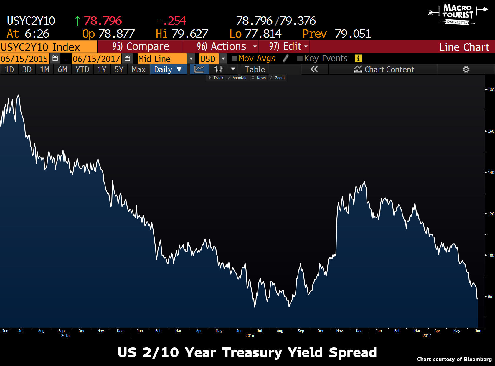
What's so big about an inverted yield curve? According to ft Journal:
The yield spread indicates the likelihood of a recession or recovery one year forward. The spread equals the difference between the short-term borrowing rate [3-month Treasury, as well as, 2 yr] set by the Federal Reserve and interest rates on longer term treasury notes, determined by bond market activity.
The spread decreased to [0.80 points on June 21, 2017 for US 2/10], following a long falling trend that began in 2014. This relatively low yield spread is the result of bond market investors seeing less future growth, along with higher interest rates stimulated by the Federal Reserve (the Fed).
A weak, but positive, yield spread indicates little chance of economic recession in the coming 12 months. Still, the figure suggests a sluggish rate of growth. It's a wait-and-see game for investors, which means cautious mortgage lenders are padding their risk premiums, causing mortgage rates to inch higher.
So far we haven't seen the inversion but it does show the fixed income crowd is trudging cautiously. One more thing on bonds, from Jared Dillian's ‘Bond Math Class' article:
There is a thumb rule in bond mathematics: If interest rates go up one percent, the price of the bond will decline approximately (duration) percent.
It's a thumb rule, it's not exact. So yes, if the duration of a 10-year note is 9, and interest rates rise from 1.6% to 2.6%, the bond will lose approximately 9% of its value.
So rates go up 1% and a bond goes down 9%. Is that risky?
You mean bonds lose value?
That will come as news to most people, because bonds are safe, you always get paid the par value in the end. Actually, bonds can lose a lot of value. And my guess is that people have been lengthening their duration in order to get a little extra yield. By moving into long-dated bonds, people have massively increased their interest rate risk.
But what of rising interest rates?
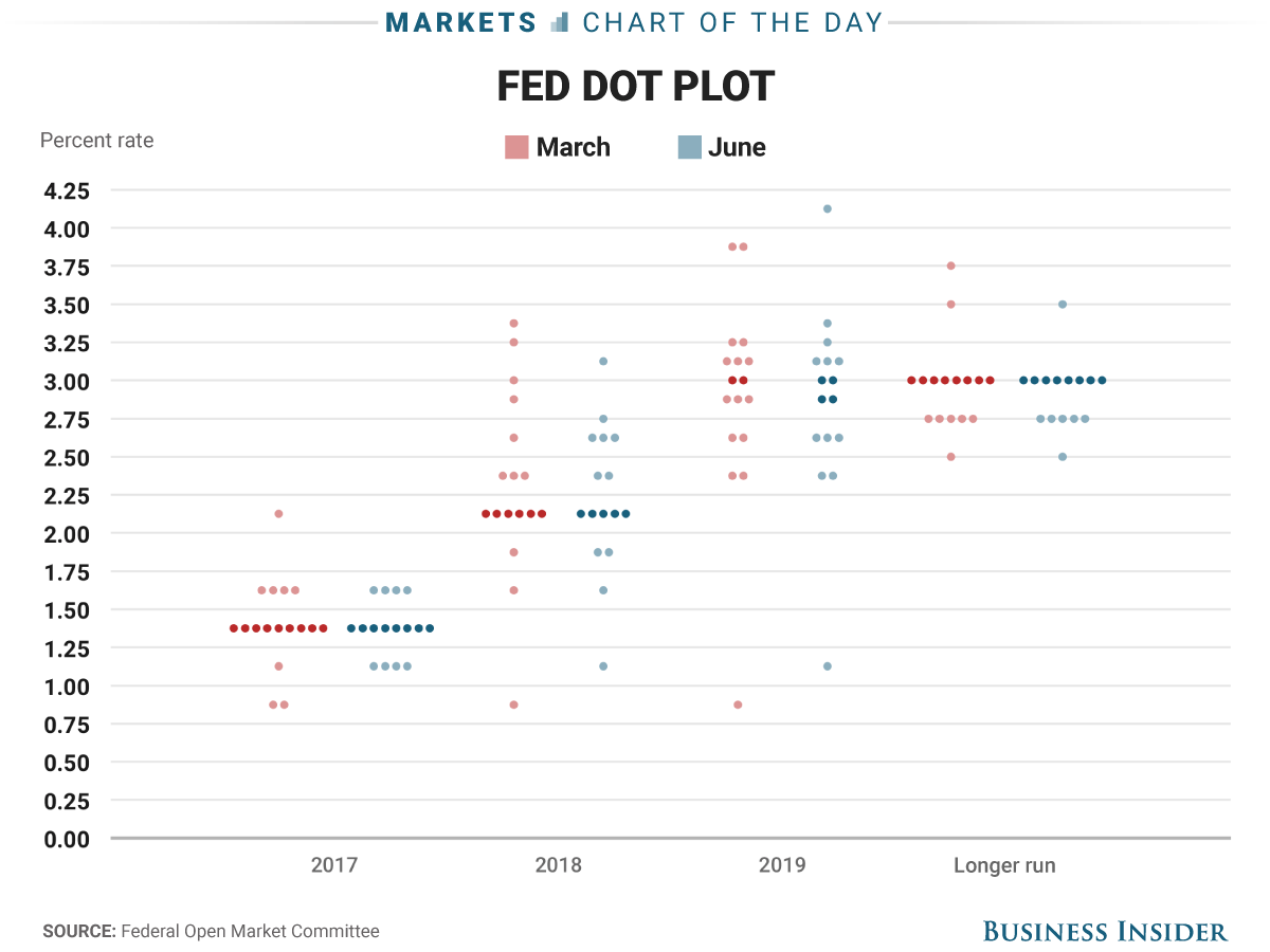
The next chart comes to us from Business Insider and shows the Fed Dot Plot, i.e. what each Fed Governor believes rates will be from now and into the future. I'll leave this chart with only one question; how hawkish can the Fed truly be given that none of them predict above 4.5% interest rate benchmark ever, NOT ONE!
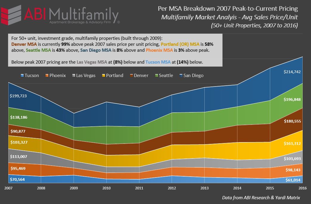
So where are current multifamily values, as expressed in average price-per-unit terms?
Answer to your question?
I have heard it stated, on more than one occasion, 2005 marked the beginning of the end for the previous bull market. Arguments can be made that it started earlier for some places but, on the whole, this hypothesis holds merit. With this in mind I'd like to posit the following question:
If 2005 was the last year of ‘sane' investment/building prior to the 2007/08 Great Recession, what would the price per unit be now (YE 2016) if average price-per-unit growth was a more modest 3% per annum, compounded?
The answer, to say the least, was very surprising. For Phoenix, the average price per unit sold in 2005 was $67,199. Based on the question above, the projected price-per-unit would have been $95,810. Phoenix's 2016 actual average price-per-unit was $98,143 or 2.5% greater than if the 3% growth had been maintained. Tucson, on the other hand, would be at $74,194 which is substantially higher than its current $61,014.
As referenced in the chart, above, most of the Western MSA's have broken their previous 2007 peak average price-per-unit record with the exception of the Las Vegas and Tucson MSA's. It should be noted that while an MSA's average price per unit amount can exceed its previous peak this does not apply to all year built/class types. For example, in Phoenix, currently 3% above its average 2007 peak, Pre-1980?s, 1990-99 and 2000-09 built product are, on average, (4%) below their previous peak.
Where does the market go from here?
Hell if I know….but the one thing that I am certain of is that housing demographics they are a-changin and we're really only in the middle of our ABI-coined ‘Decade of the Renter' which began in 2012.